The Color Psychology of Workspaces
In the realm of office design, the influence of color psychology is often undervalued. At Fast Cubes, we understand that the colors chosen for a workspace, especially a cubicle, can significantly impact productivity, mood, and overall job satisfaction. This post explores how to choose the right color palette for your cubicle, turning it into a vibrant and effective workspace.
Understanding Color Psychology:
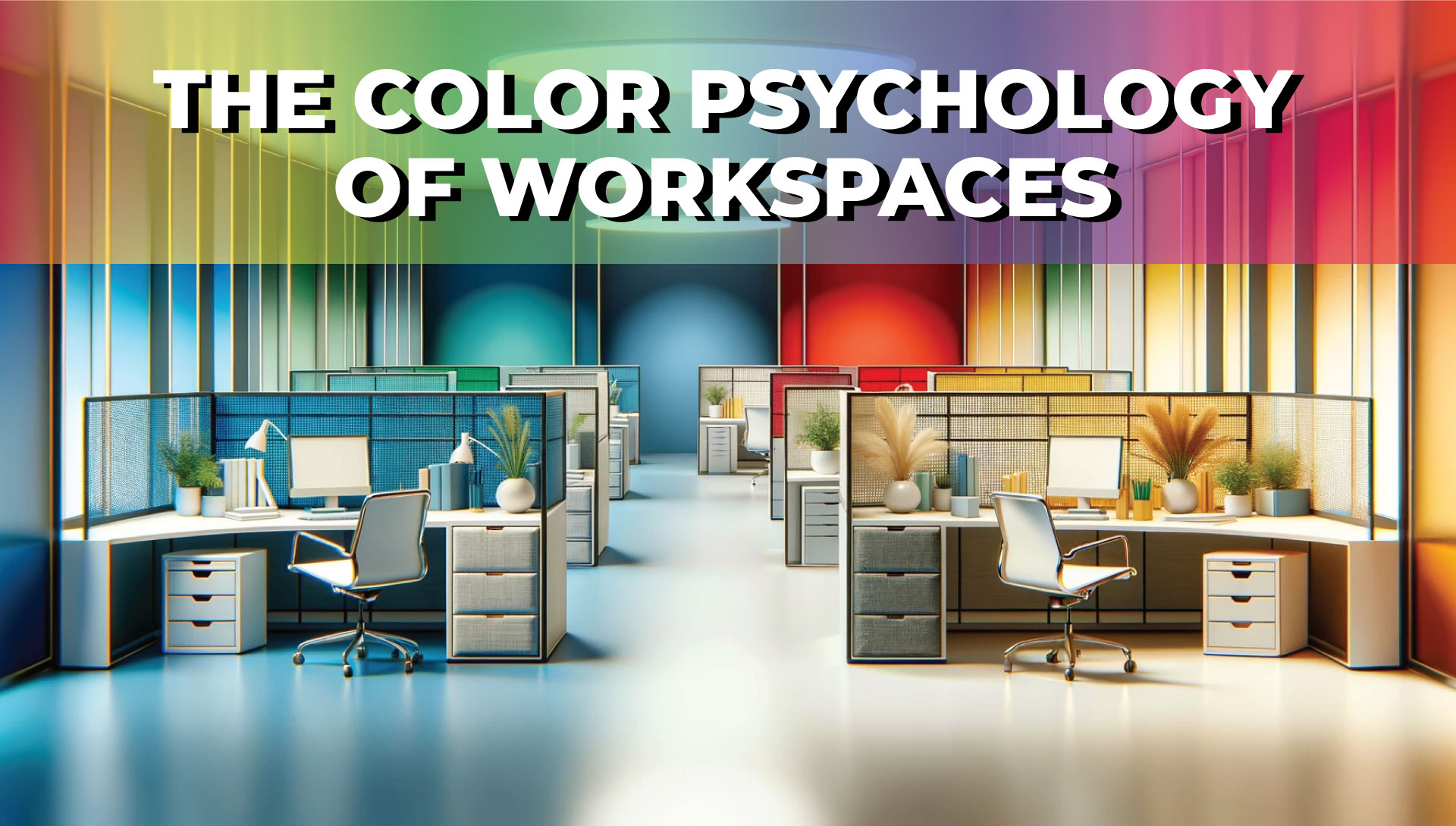
Color psychology is the study of how colors affect perceptions and behaviors. In the context of a workspace, certain colors can evoke specific emotional and physical responses. For example, blue is often associated with productivity and calmness, while red can trigger feelings of energy and urgency. By understanding the psychological effects of different hues, you can make informed decisions about your cubicle’s color scheme.
Choosing Your Base Color:
The base color of your cubicle sets the tone for your entire workspace. Neutral tones like beige, gray, or soft white create a calm and flexible backdrop. These shades are ideal for environments where concentration and focus are key. For a more dynamic and energetic atmosphere, consider soft blues or greens. These colors promote tranquillity and efficiency without overwhelming the senses.
Accent Colors for Personality and Energy:
Accent colors add personality and can influence your mood and energy levels. Brighter colors, like yellow or orange, can stimulate creativity and optimism but use them sparingly to avoid overstimulation. Incorporating these colors through accessories, such as desk organizers or wall art, can be a great way to inject energy without overpowering the space.
The Impact of Color on Productivity:
Research shows that certain colors can enhance productivity. Blue, for instance, is often linked to improved focus and calmness, making it an excellent choice for task-oriented work. Green, known for its calming effects, can reduce eye strain and help maintain steady energy levels throughout the day.
Creating a Cohesive Look:
When selecting colors for your cubicle, consider the overall office aesthetic. Your cubicle should be a personal space but also maintain a cohesive look with the surrounding environment. This harmony creates a visually appealing and professionally consistent workspace.
Personalization and Flexibility:
At Fast Cubes, we encourage personalizing your workspace while keeping flexibility in mind. Changing seasons, moods, and projects might require different color needs. Opt for elements that can be easily swapped, like interchangeable panels or desk accessories, to adapt to these changing requirements.
Fast Cubes Color Swatches: Personalizing Your Space
At Fast Cubes, we take pride in offering a diverse range of color swatches to personalize your cubicle. With options like Straw/Maple, Taupe/Maple, Taupe/Gray, Fog/Gray, Seagull/Gray, Seagull/Pepperdust, and even a Custom Swatch. These choices allow you to align the cubicle’s look with your color preferences and the psychological impacts discussed earlier.
Choosing the right color palette for your cubicle is more than just an aesthetic decision; it’s about creating a workspace that fosters well-being and productivity. By considering the psychological impact of colors and your personal preferences, you can transform your cubicle into a vibrant and effective workspace. Remember, at Fast Cubes, we’re here to help you create the ideal office environment with our customizable cubicle solutions.